Inventravel
Inventravel
Designing a smarter way to discover meaningful travel experiences.
Designing a smarter way to discover meaningful travel experiences.
Designing a smarter way to discover meaningful travel experiences.
Role
Product Designer
Status
In development
PLATFORM
Web Responsive
Team
Founder + Me
I designed Inventravel end to end, from its product strategy, experience architecture, mood board and design system to the complete consumer-facing travel marketplace and operator-facing B2B dashboard, across desktop and mobile.
Product Strategy
0 → 1 design
UX Research
Discovery flow
Design System
00 / PROJECT CONTEXT
Where the project started
THE BRIEF
THE BRIEF
BRING OPERATORS TOGETHER AND LIST TRIPS.
BRING OPERATORS TOGETHER AND LIST TRIPS.
THE OPPORTUNITY
THE OPPORTUNITY
HELP PEOPLE DECIDE WHICH EXPERIENCE FITS THEM
HELP PEOPLE DECIDE WHICH EXPERIENCE FITS THEM
Inventravel started as a simple client brief, a marketplace where people could discover group trips from different travel operators. Bring the operators together, show the trips, let people browse. Easy, right?
But I travel a lot myself, so I could see one actual problem before I even opened Figma. People already have options. There are dozens of places to browse trips online. What they don't have is a clear way to choose between them.
So I stopped thinking of Inventravel like a listing site, and started thinking of it like a guide, something that helps you decide, not just browse.
01 / the friction a.k.a opportunity
Travel planning should feel exciting. Most of the time it turns into a long scroll. Similar destinations. Similar prices. Similar photos. Similar promises. After a point, every trip starts looking like the last one.
The options are there.
The confidence isn't.
02 / the core insight
Almost every travel platform opens with the same question. Where do you want to go? That only works if the person already knows. A lot of people don't.
What they usually have instead is a feeling.

“People don’t always know where they want to go. They usually know how they want to feel.”
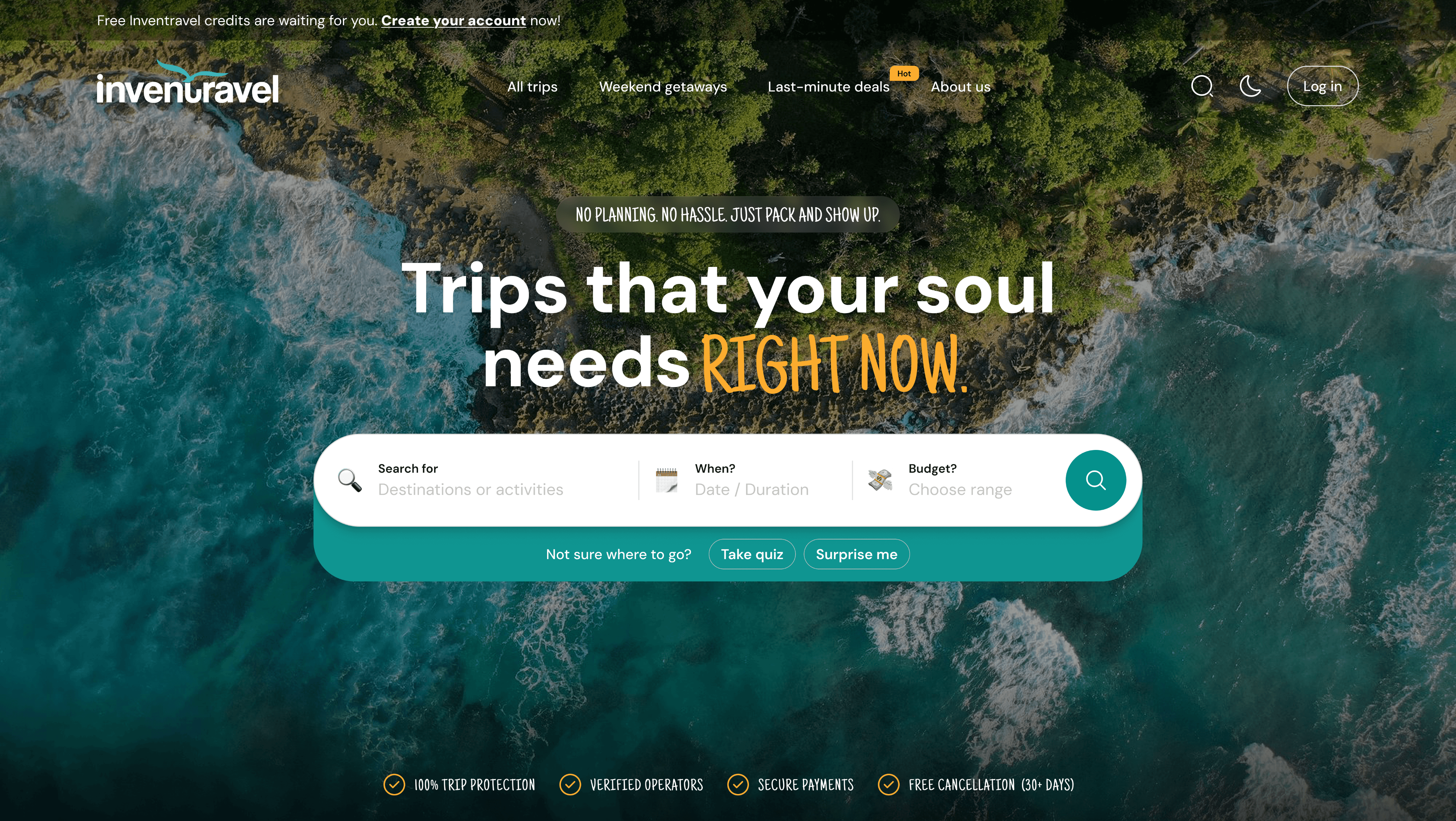
That's the line the whole homepage is built around. It's right there in the headline. "Trips that your soul needs, right now." No planning, no hassle, just pack and show up. It isn't a tagline for the sake of having one. It's a promise the rest of the flow actually has to keep.
03 / the problems i saw
A few things kept surfacing the more I dug into this.
Users didn’t always know where to start.
Not every user knows their destination upfront, so the product had to help them begin with whatever clarity they already had.
More options were creating more noise.
Adding more trip cards would not solve the problem if users still couldn’t understand which trip actually fit them.
Budget was hidden too late in the journey.
For most users, budget is one of the first decisions, so keeping it inside filters made discovery feel less direct.
Trust showed up too close to the booking.
Travel involves money, time, and sometimes strangers, so users needed confidence much earlier in the journey.
So the real question became this :
So the real question became this :
How can we help users discover the right travel experience without making them feel overwhelmed, unsure, or unsafe?
How can we help users discover the right travel experience without making them feel overwhelmed, unsure, or unsafe?
How can we help users discover the right travel experience without making them feel overwhelmed, unsure, or unsafe?
04 / the goals
01
Help users start without a fixed destination
02
Make discovery feel guided, not overwhelming
03
Support mood, budget, days, and activity-led browsing
04
Bring trust earlier in the journey
05
Make trip comparison easier and clearer
06
Move users from browsing to confident shortlisting
05 / what changed in the experience
As this project is still in development, I can’t share the complete flows and screens publicly. If you’d like to see more, feel free to connect. I’d be happy to walk you through the full experience.

01. Multiple ways in, not one search bar
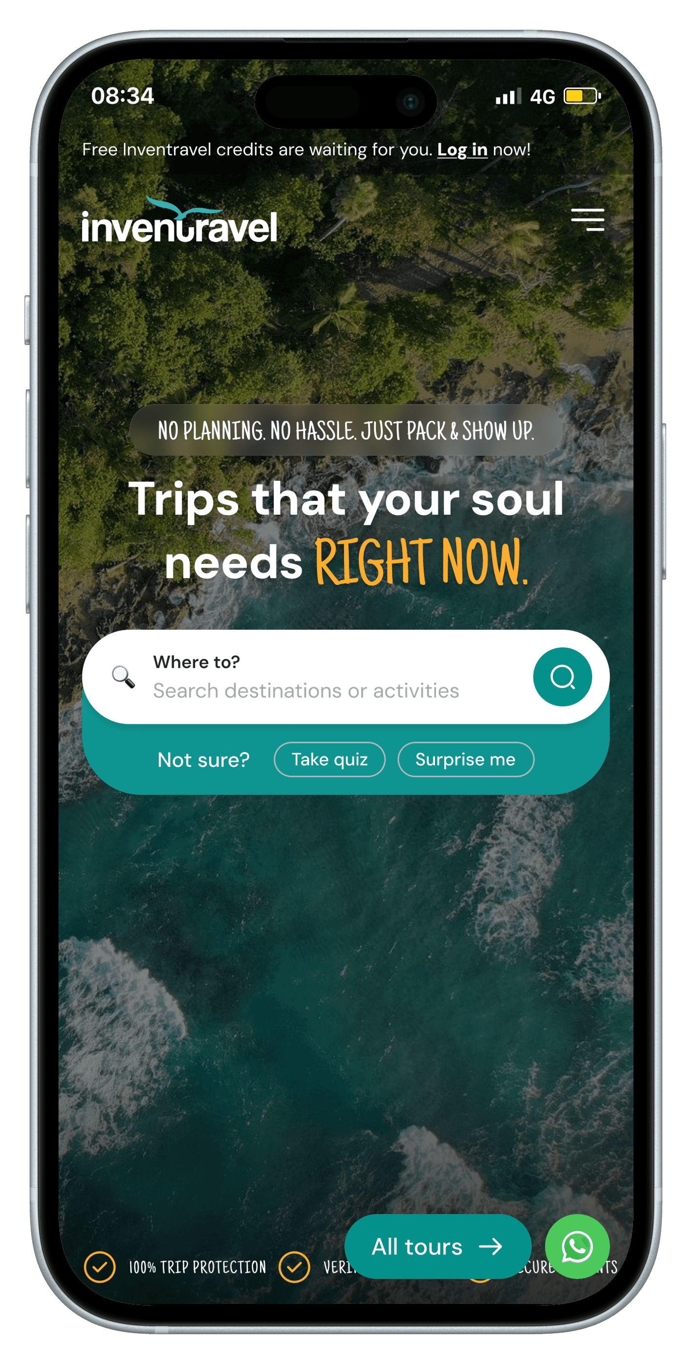
Not every user begins with a destination. Search supports users who know, while the quiz and “Surprise Me” guide those who don’t.
05.1 / responsive experience


06 / what i chose not to design
Just as much of this project was about what I intentionally left out.

I didn't want the answer to every problem to be "show more trips." I didn't want the homepage to turn into a decorative destination board with nothing to actually do on it. I didn't want filters that felt like a form someone had to fight through. And I refused to assume every visitor already knows where they're going, which is exactly why "take a quiz" sits below the search bar, and not three scrolls down.
The product had to guide.
Not overwhelm.
07 / ‘expected’ product impact
Since the product is currently in development, these are the outcomes the design aims to achieve.
for users
Less decision fatigue
Better discovery
Feel confident before booking
Explore beyond popular destinations
for business
Clearer product position
Stronger differentiation
Increase booking intent
Encourage repeat customers through better personalised travel experiences
08 / VALIDATION PLAN
01
Search vs guided discovery usage
To see how users begin discovering trips among the multiple entry paths.
02
Guided discovery completion rate
To understand whether the quiz feels simple enough to finish.
03
Trip card click-through rate
To check if discovery paths are leading users to relevant trips.
04
Filter usage rate
To understand which decision factors shape users’ trip choices.
05
Shortlist / save rate
To see whether users are moving from browsing to intent.
06
Enquiry / booking intent rate
To check if users are confident enough to take the next step.
07
Trust signal engagement
To understand which trust details users check before booking.
08
Returning user rate
To see whether credits, stories, and curated discovery give users a reason to come back.
09 / what i learned
Discovery should meet
users where they are
Discovery should meet
users where they are
This project taught me that more options do not always create a better experience. People begin with different levels of clarity, confidence and intent. What matters is understanding where they are, showing the right information at the right time, and guiding them without taking away their control. When that balance is right, even complex decisions can feel simple.
